Branding
Description
A cohesive system of design elements including color, elements and imagery, tailored to communicate our brand identity and values. By unifying these elements, we ensure consistency and resonance across all platforms, fostering recognition and connection with our audience.
My Role
Visual Designer
Brand Visual Language
The objective of the Brand Visual Language project was to address the issue of inconsistent and visually unengaging brand elements across various touchpoints, such as the website and brand collateral. The current visual language does not effectively communicate the brand's personality, values, and positioning. The primary goal was to establish a unique and memorable visual identity that aligns with the brand's tagline "The Power of Simple." We aimed to create a cohesive and consistent design language that accurately reflects the brand's essence and resonates with the audience.
Outcome
Achieved 90% unified and recognizable brand lanuagage across all platforms, enhancing overall brand recognition and loyalty.
Created a seamless and engaging experience that effectively communicated the brand's values and aesthetic.
Process
The project involved a comprehensive series of actions to address the challenges and achieve the project's objectives.
Visual Audit
We conducted a thorough review of the brand's existing visual elements, including the website, marketing materials, and other collateral. This initial step allowed us to pinpoint inconsistencies and areas that required improvement, forming the foundation of our project.
Moodboard Creation
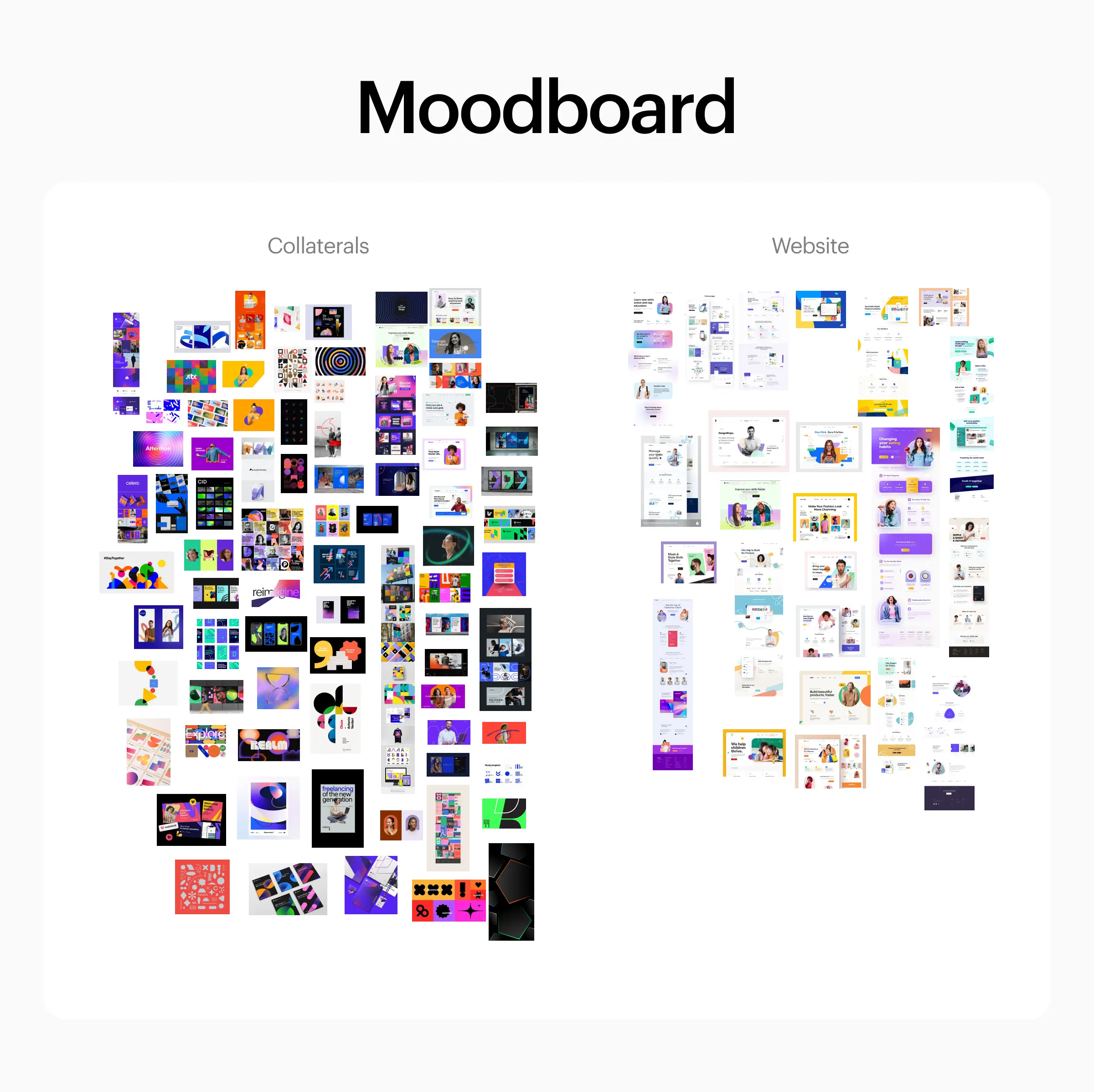
To establish a clear creative direction, we curated a moodboard. This visual inspiration board served as a visual guide for defining the desired brand personality and style, helping us lay the groundwork for our brand visual language.
Competitive Analysis
We analyzed the visual languages employed by competitors in our industry. This market analysis allowed us to identify opportunities for differentiation and innovation, ensuring that our brand's visual identity would stand out and resonate with our target audience.
Shapes
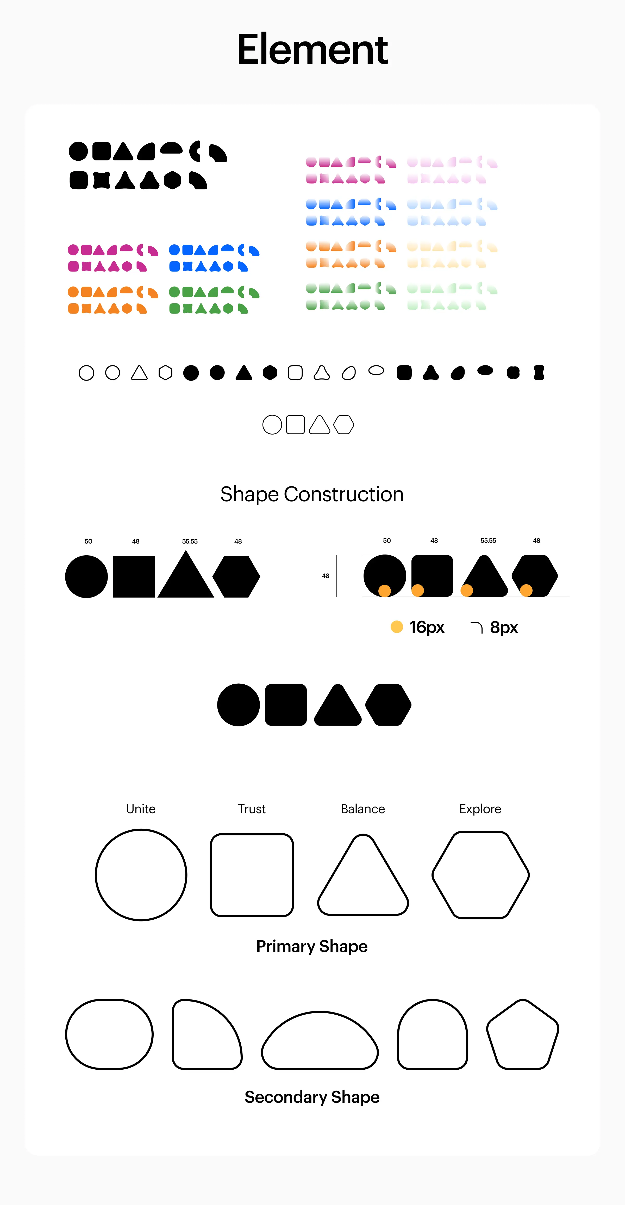
Keeping in mind the brand's tagline, "The Power of Simple," we developed a set of primary shapes (Circle, Square, Triangle, Hexagon) to represent core brand values. We wanted to add more shapes to our brand to make it dynamic. With this, 5 Secondary shapes were created which evolved from our primary shapes.
Color Gradient Palette
Our brand had established color palette and we wanted to create unique and innovative visuals that represent our brand. Gradients were introduced which can add depth and visual interest to the brand visual language by creating smooth color transitions that catch the eye and draw attention.
Style Creation
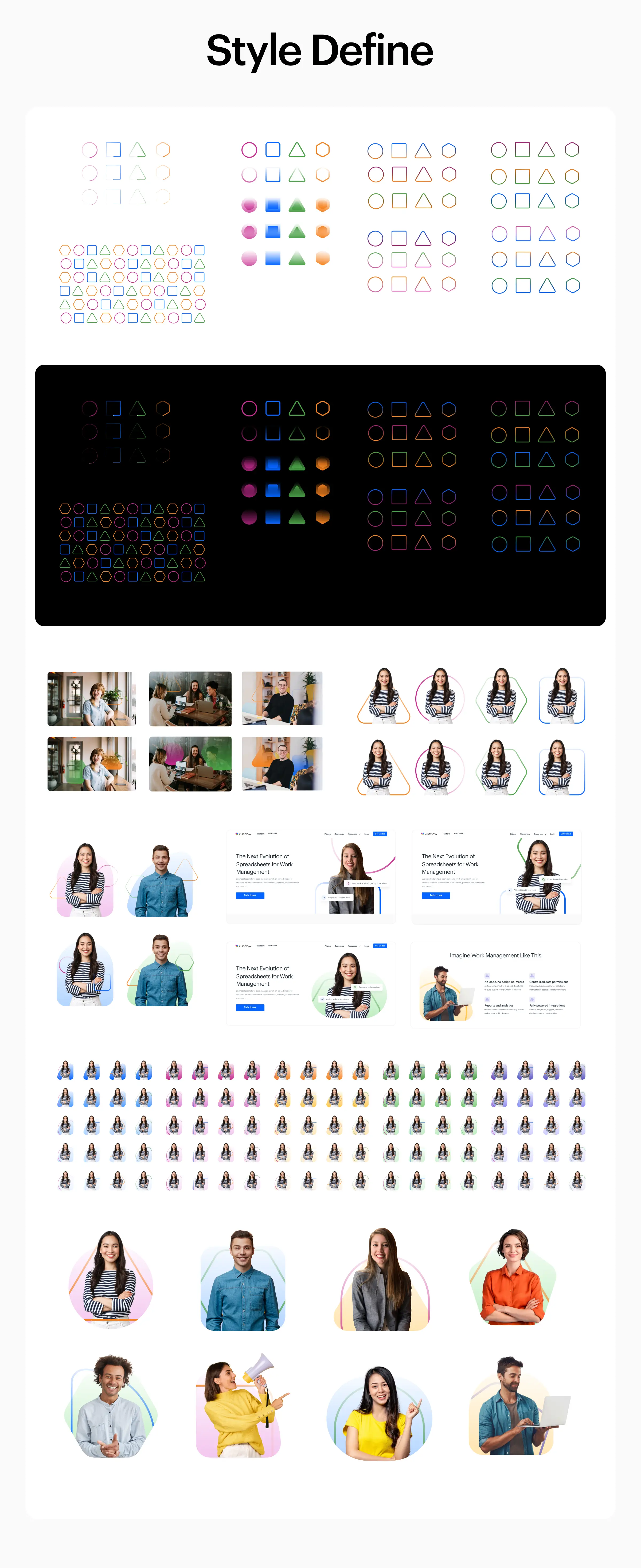
We combined the shapes and color palettes to create a unique visual style we called "Flow," which featured gradient transitions and dynamic elements.
Website Enhancement
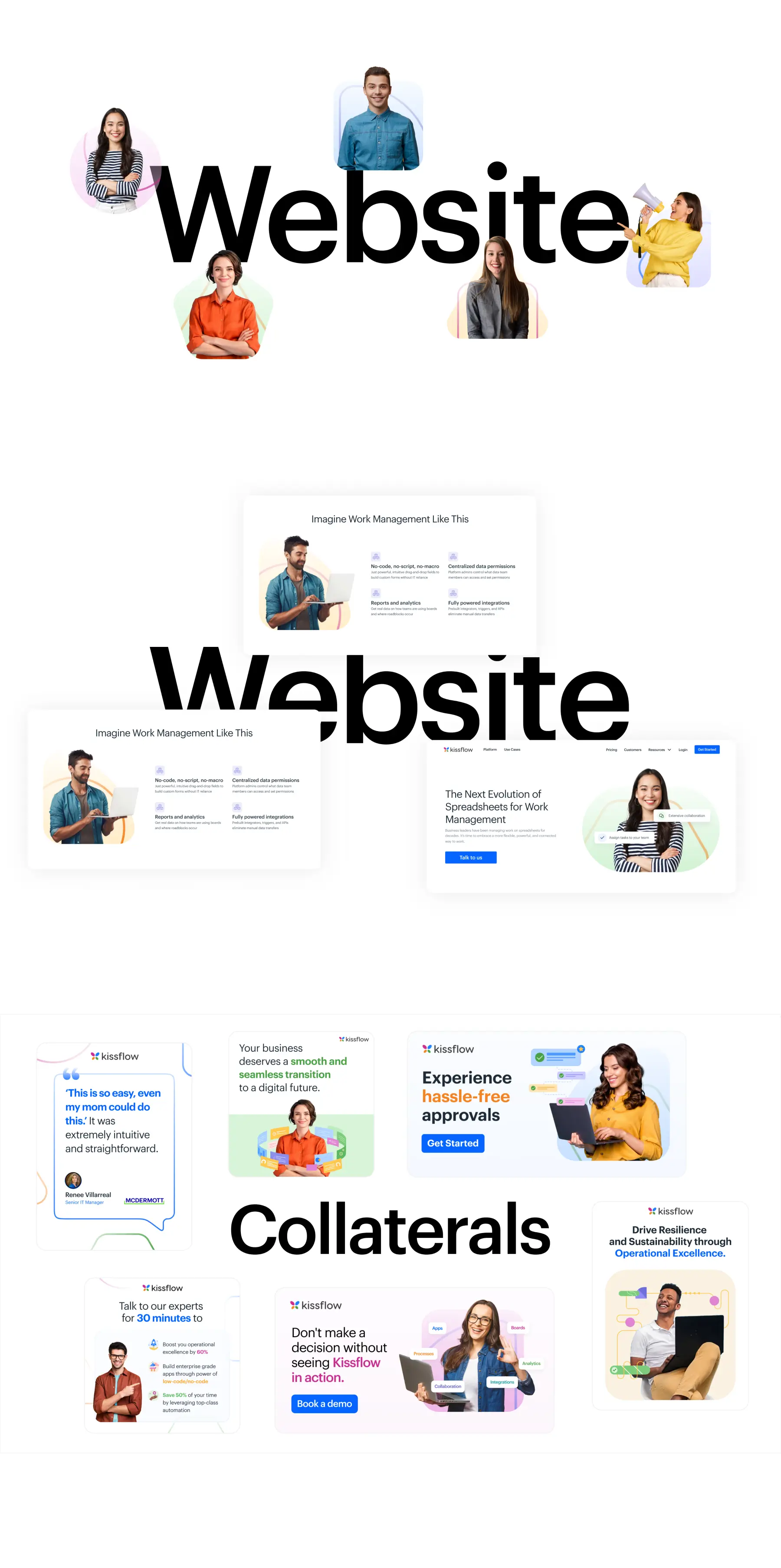
We undertook a significant revamp of the website's visual style and the utilization of illustrations. The website design was enhanced to incorporate real photos of people, making the brand more relatable and personable for our audience. This enhancement was crucial to creating an authentic and engaging online experience.
Design Process
Output
Shapes
Inspired by our tagline “The Power of Simple,” we created primary shapes—Circle, Square, Triangle, and Hexagon—each symbolizing Unite, Trust, Action, and Explore, with rounded corners for a modern look. To add dynamism, we developed five secondary shapes evolving from these primary forms. This approach ensured a sleek and cohesive visual identity.
Gradient
To create unique and innovative visuals, we introduced gradients to our established color palette, adding depth and visual interest with smooth color transitions. Our palette includes tones from 100 to 700, with 500 as the primary color. We derived gradients from lighter (100), medium (300), and darker (500) shades, ensuring they work on both light and dark backgrounds.
Style
Our unique visual style, called “flow,” merges our shapes and color palette, using gradients to create smooth transitions, evoke emotions, and add dynamic visual impact. We assigned specific gradient colors to each shape: Pink for Circle, Blue for Square, Orange for Triangle, and Green for Hexagon. Inspired by our logo, these shapes are partially visible within frames, creating recognizable brand visuals. While placement can be adjusted, the overall structure of this lockup must remain consistent.
Image Style
The website initially lacked a consistent visual style, and the illustrations were ineffective. To humanize the brand and create a relatable experience, we incorporated real person photos. We combined our defined shapes and gradients to create a visually appealing style. Using gradient-filled shapes as backgrounds, gradient-stroked shapes as middle-ground, and real person photos in the foreground provided design flexibility. This approach showcased diverse visuals, established a human connection, and maintained a consistent design language.
