Design System
Description
The design system for Kissflow was developed to create a cohesive and consistent visual language across all digital platforms. This system encompasses a comprehensive set of guidelines for typography, color schemes, and UI components to ensure a unified user experience.
My Role
UI Designer
UX Designer
Challenge
The primary challenge was to overhaul the outdated design system and address significant issues that were affecting both the design and development processes. These issues led to inconsistencies and inefficiencies in the output, necessitating a comprehensive update to align the design system with current market standards and best practices.
Responsibilities
I was the owner of the Kissflow design system, maintaining to ensure consistency and reliability across all touchpoints. This role leveraged my visual design expertise to enhance usability and align with Kissflow's evolving brand identity.
Process
I have created a proper roadmap for revamping design system. Separated into to 2 Phases to complete the whole design system and also maintaining our daily tasks as well as other goals.
Audit Existing Design System
While the current design system has more issues, I conducted a thorough review of the current design system to identify inconsistencies and outdated elements. This involved evaluating all components for usability, accessibility, and alignment with brand standards.
Define Problems and Issues
Identified specific pain points and gaps within the existing design system. Documented these issues to provide a clear roadmap for necessary improvements and updates.
Conducted a Q&A with design team to address the issues and pain points on the current design system.
Problem statement on current design system:
Grid system is not properly calculated and well designed where the design and developed pages doesn't match up.
Color system are not properly scaled and color matched. Eg., Blue 100 and Pink 100, is inconsistent, with blue 100 appearing lighter and pink 100 darker than intended.
A suggestion from designer, to increase the number of tints and shades for colors.
2 types of typography system were used, Default and Blog, Since Blog has different style for better redability. The Blog type system had more issues where development had a mix up older & current version where the design doen't match up with developed page.
There weren't proper shadow system for the current system and each time designer has to create which creates more varient.
Basic button components were there but need more components to design faster.
From Developer side, even the current design system weren't properly developed.
Create design tokens to create consistency.
Research and Analysis
Performed extensive research on modern design trends and best practices. Analyzed user feedback and industry standards to inform the development of a more robust and user-friendly design system.
From the analysis, I have perfomed extensive research on design system used by other companies and what are the best practices.
Understanding the grid system was a bigger challenge and this is where design and development meets pixel perfect output. Since developers use a framework called Bootstrap, I have started researching on grid system and collaborated with developer to understand holistically.
Took alot of design system reference from different sites to know industry standards.
https://designsystems.surf/
https://designsystemsrepo.com/
https://www.designsystemsforfigma.com/
https://www.designsystems.com/Deep understanding and usage of color, typography and basic components to scale up and expand the design system.
Redesign
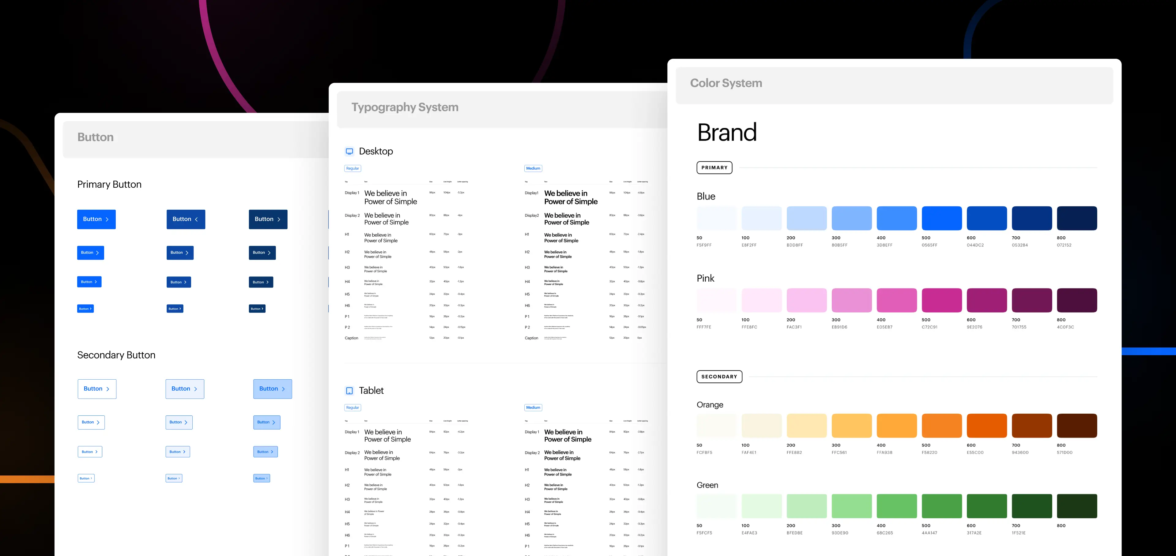
The redesign phase involved a complete overhaul of the existing design system to address the identified issues and align it with modern standards. We started by redefining the grid system to ensure consistency between design and development, integrating it seamlessly with the Bootstrap framework. The color system was meticulously recalibrated, correcting inconsistencies in tints and shades to achieve harmonious contrast and balance. We expanded the typography system, refining it for better readability and coherence across different platforms, and resolved the confusion between the default and blog styles. The shadow system was standardized, providing designers with predefined options to maintain uniformity. Additionally, we enriched the component library with a broader range of elements, enabling faster and more efficient design processes.
Throughout the redesign, I have collaborated closely with developers to implement design tokens, ensuring consistency and scalability across all digital assets.


