Description
NIIT is a global learning outsourcing company. An American corporate training services helping companies run training like a business by demonstrably transforming L&D.
My Role
Branding
Outcome
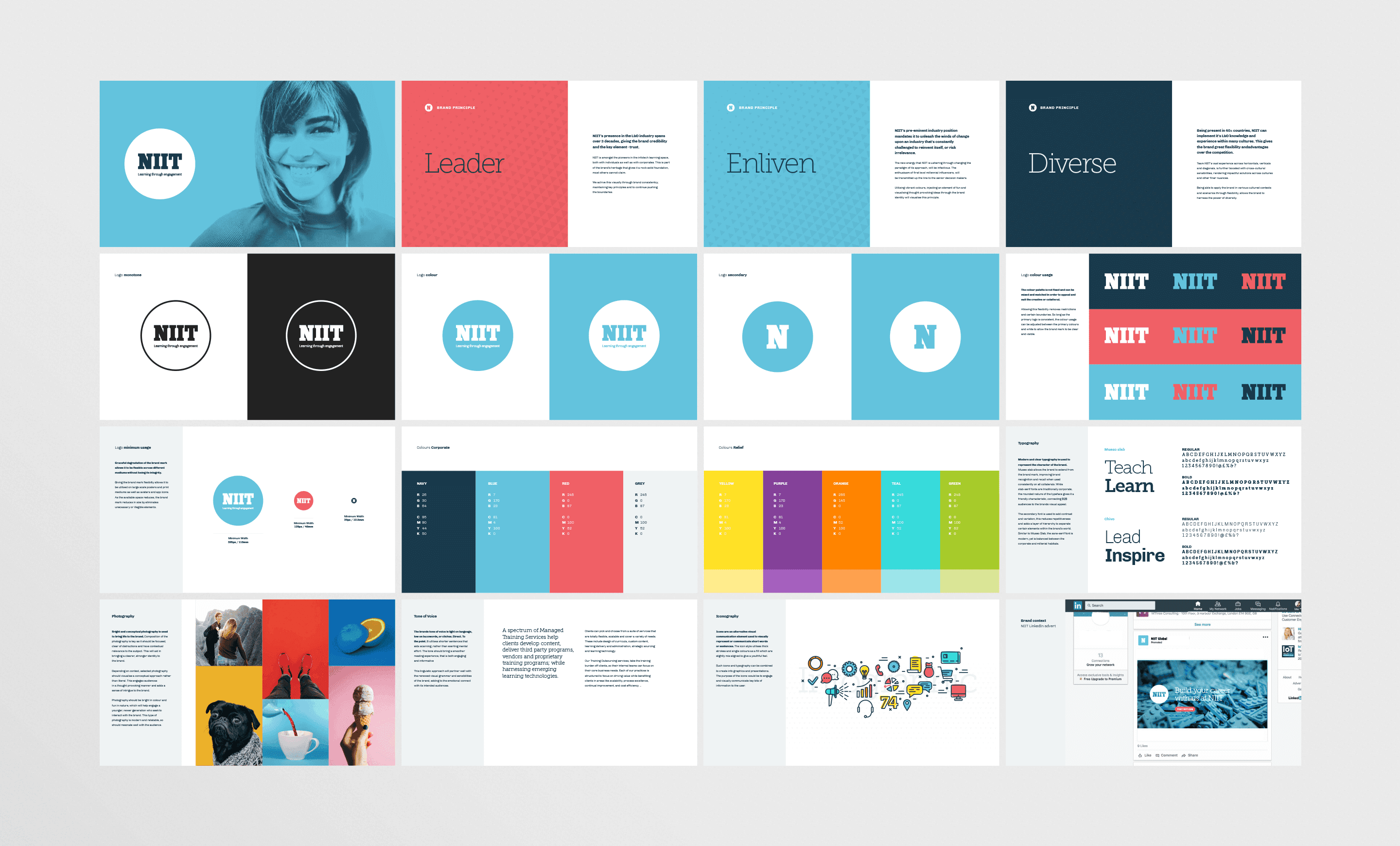
A fresher look and feel for the brand and created a guideline for it.
Built 200 pages using the customized template library.
Challenge
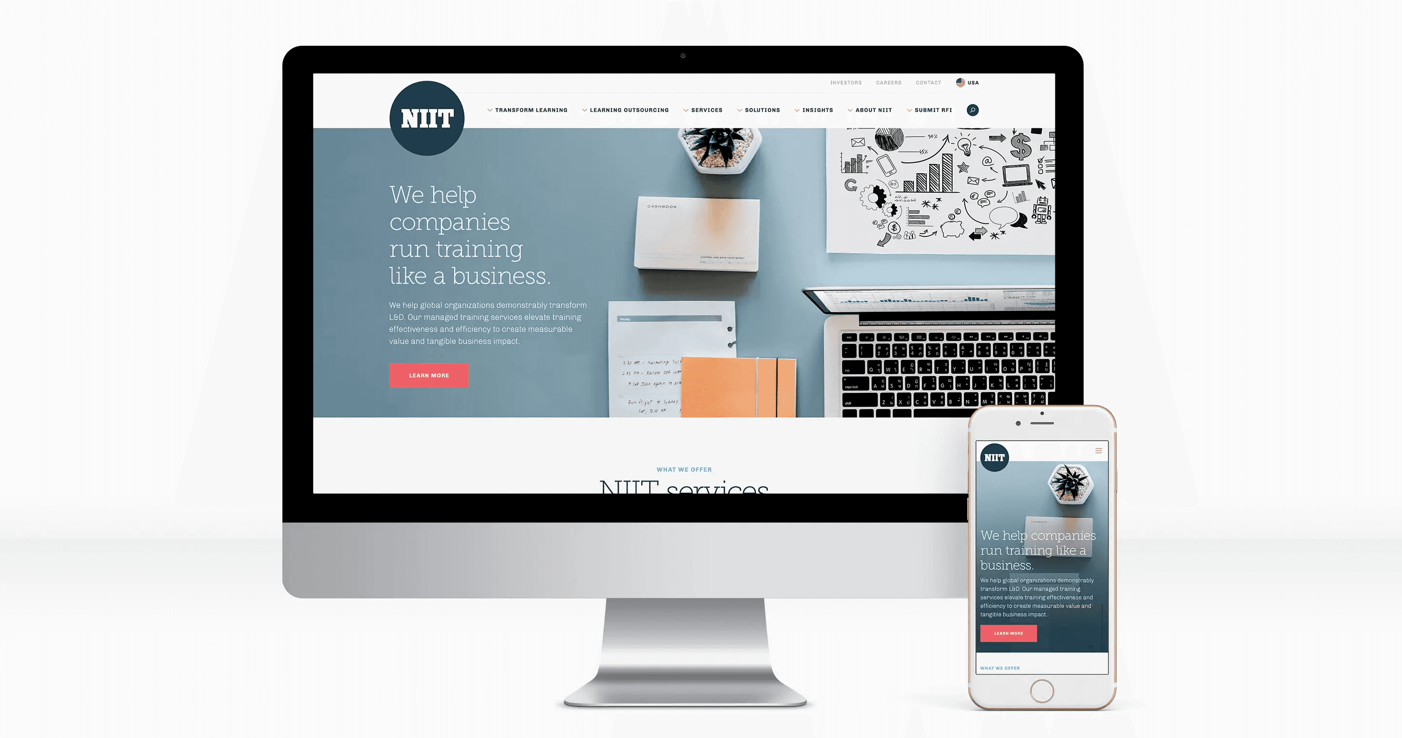
The client wanted to re-brand and revamp the website to have a new look for the brand and to have flexibility on digital platform. They needed a complete digital visual identity overhaul while also communicating their value proposition more clearly.
Branding
While the previous typeface of the logo had incredibly strong equity with audiences, placing the typeface on a circle gives a positive emotion and unity which would amplify its existing heritage and connect with viewers of all generations. By using an unfixed color palette for the logo, we removed the boundaries on how it could be displayed – it could be mixed and matched to suit the context. Bright and conceptual photography is used to bring life to the brand. Composition of the photography is key as it should be focused, clear of distractions and have contextual relevance to the subject. This will aid in bringing a clearer, stronger identity to the brand. Pattern were used to project uprising and movement towards top which allows to stay consistent to the brand.
Brand Collaterals
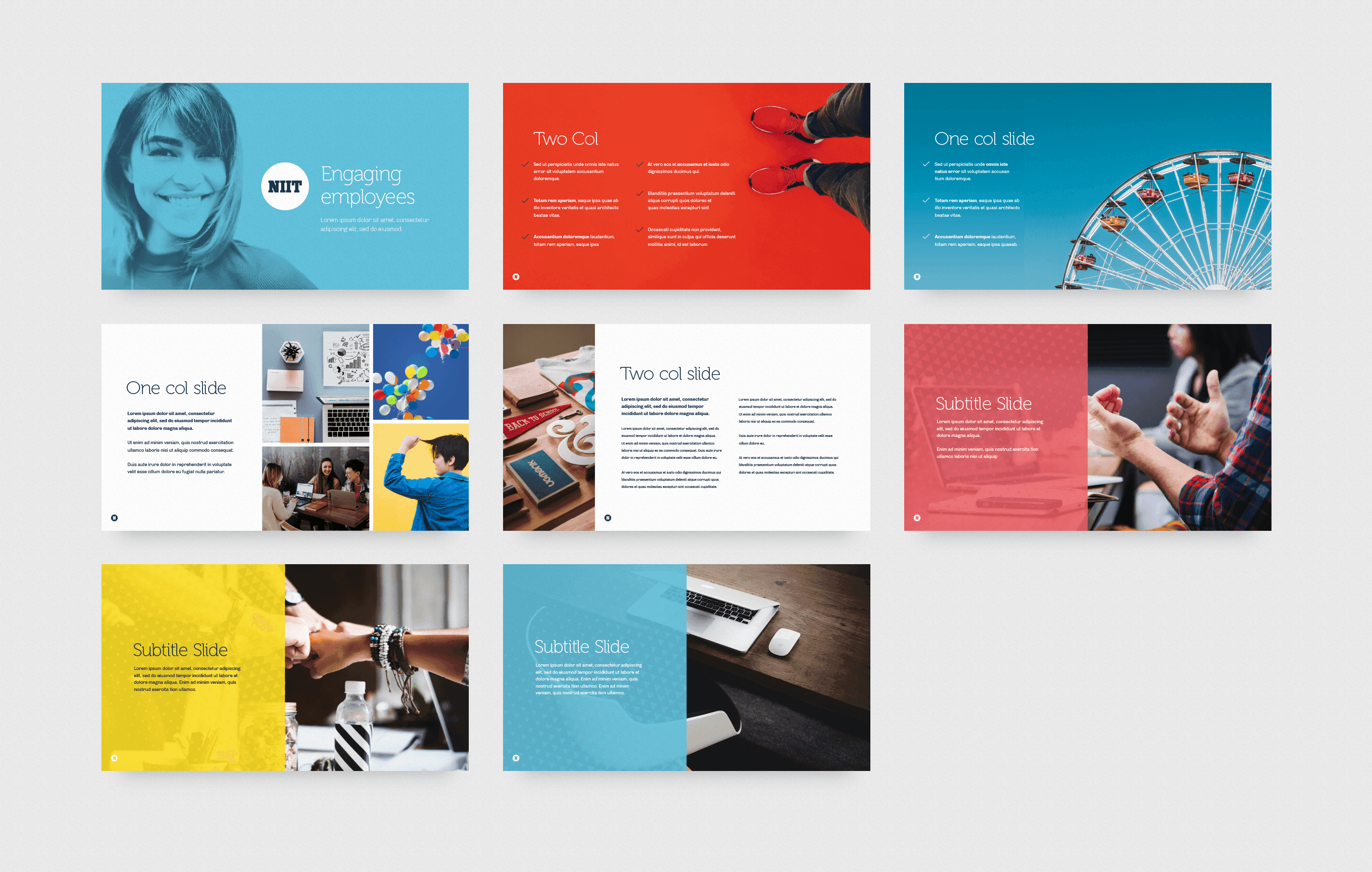
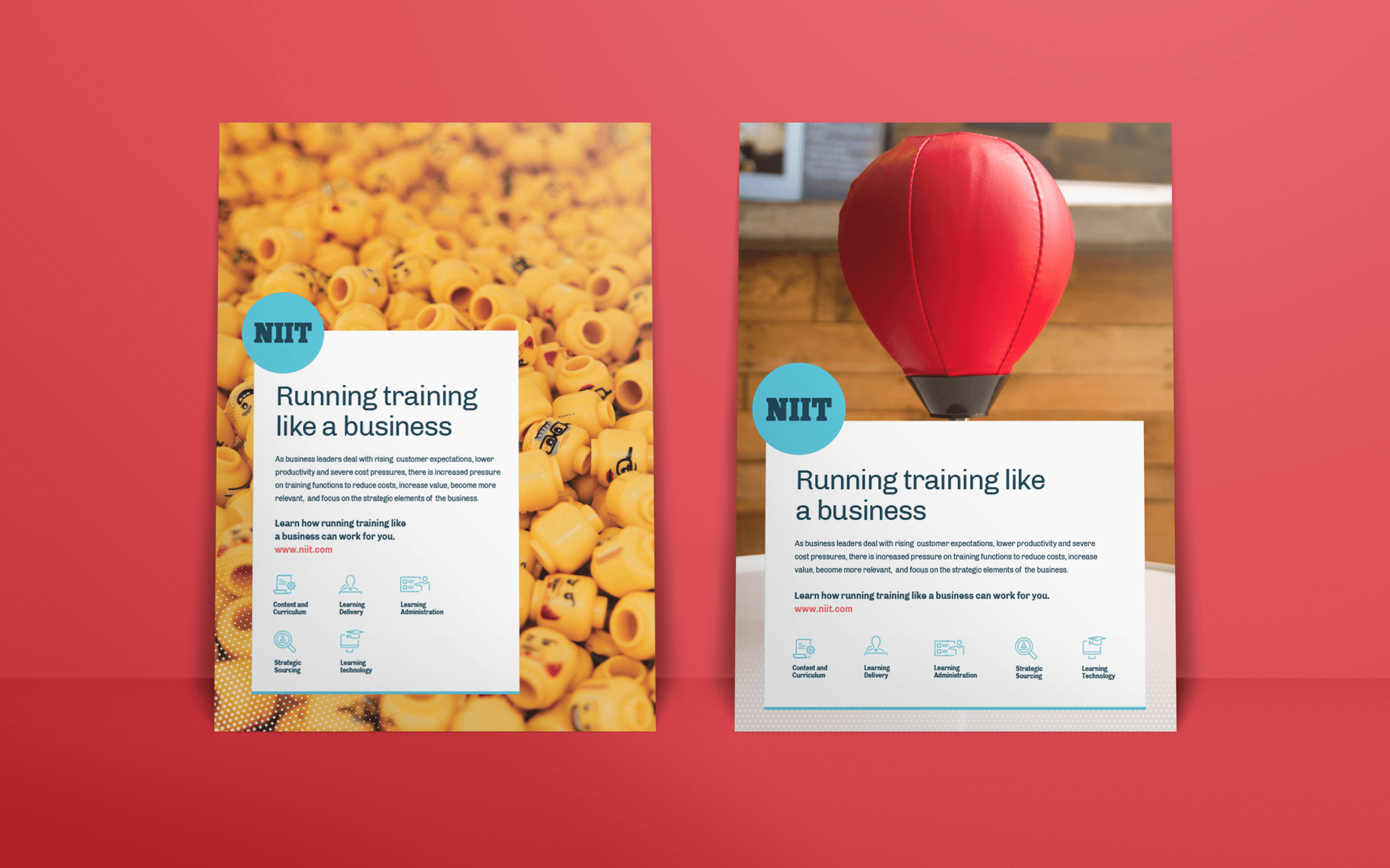
After setting up the brand's look and feel, we straight away started working on the business cards, presentation template, brochures, flyers, letter head, envelope and other. The brand guideline was the base foundation for the style, We quickly built all collaterals which made sure of brand consistency. We made sure every collaterals has some unique layout to distinct between other brands that make the NIIT stand out.
Website
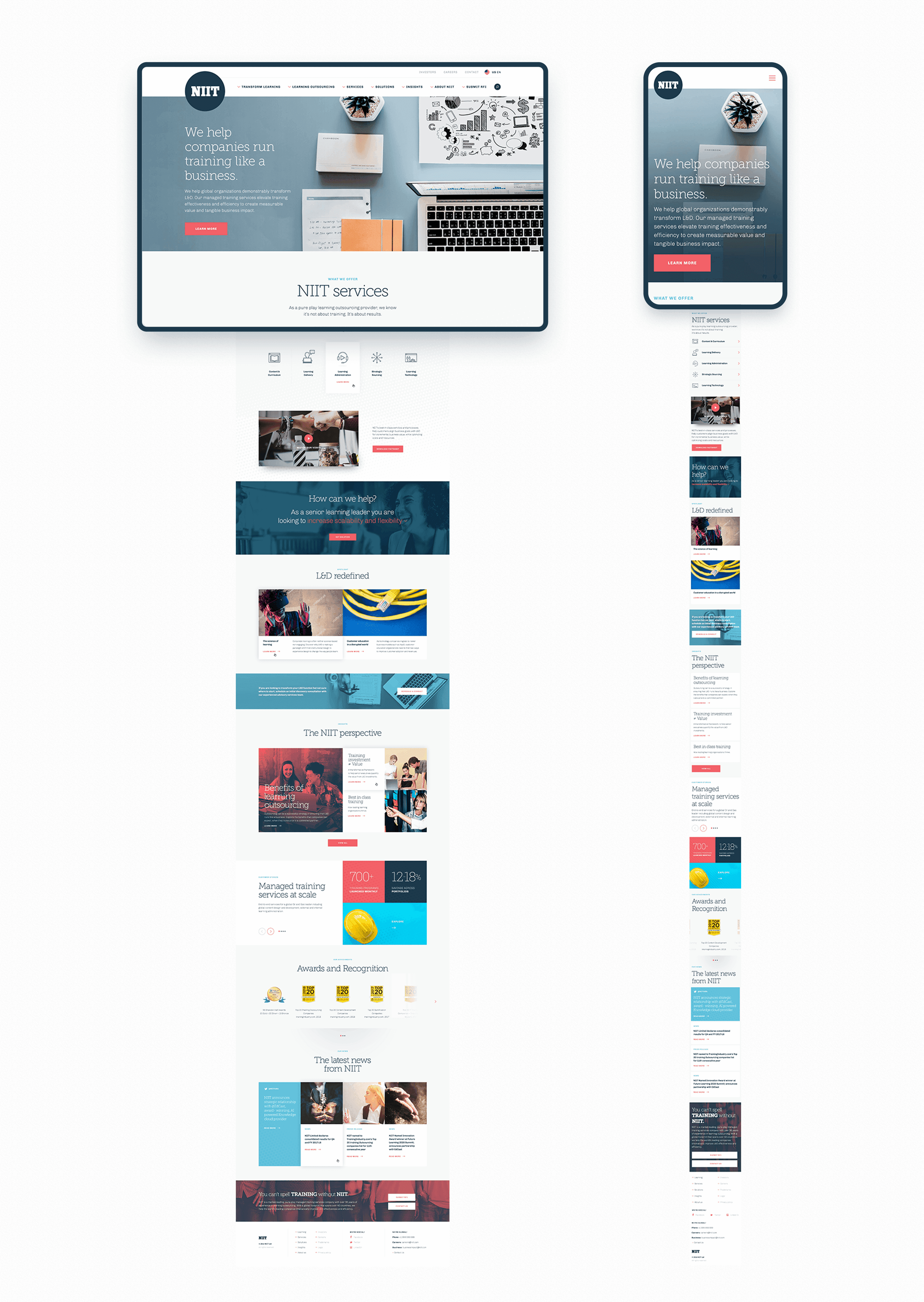
While the previous typeface of the logo had incredibly strong equity with audiences, placing the typeface on a circle gives a positive emotion and unity which would amplify its existing heritage and connect with viewers of all generations. By using an unfixed color palette for the logo, we removed the boundaries on how it could be displayed – it could be mixed and matched to suit the context. Bright and conceptual photography is used to bring life to the brand. Composition of the photography is key as it should be focused, clear of distractions and have contextual relevance to the subject. This will aid in bringing a clearer, stronger identity to the brand. Pattern were used to project uprising and movement towards top which allows to stay consistent to the brand.
Pattern Library
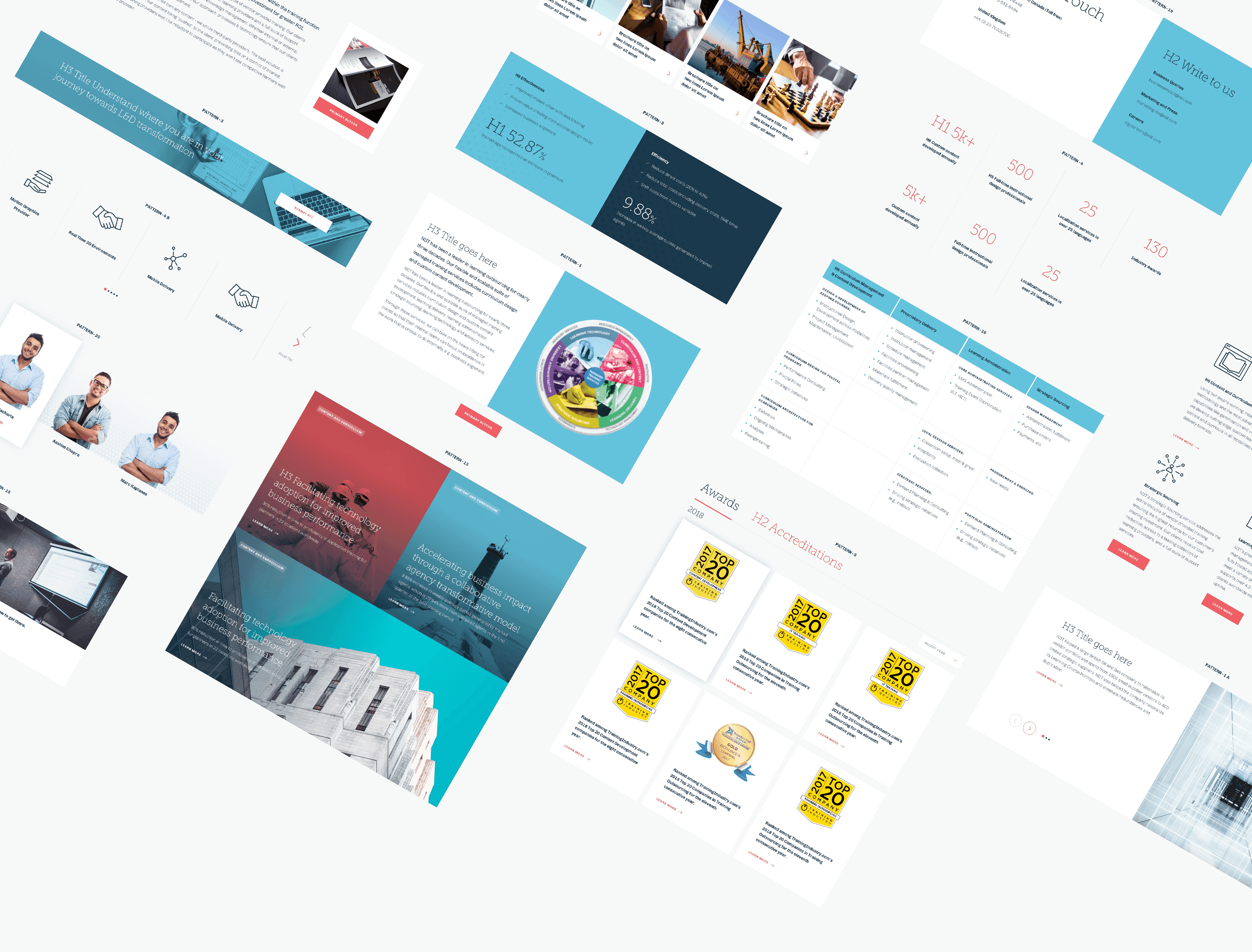
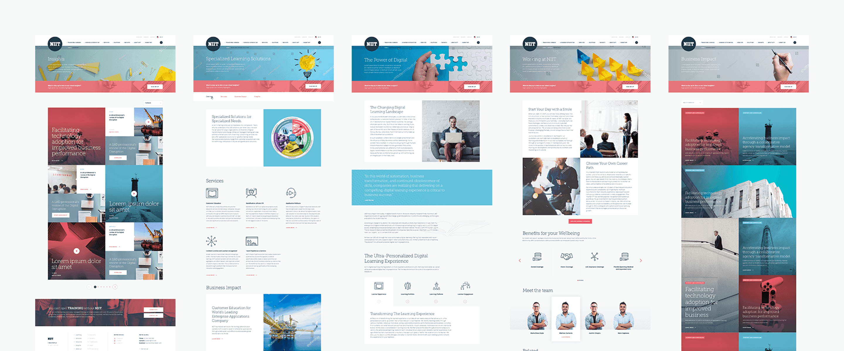
Having 200 pages and lot of features, designing each page would take more time. Design guideline and pattern library were created to achieve a visual consistency, seamless flow of website experience and making the process quicker. From the wireframe, taking the pages with different structure were designed and then from that, each unique elements had been collected which made into UI-Patterns.
Each patterns had Short-code name and explained how flexible a pattern can work in a PDF format and shared across Developers making a seamless workflow. Large number of Icons, illustration and images were organised to form a design library and handed over to the Developers. This process made us to develop and deploy the site faster and efficient.
